Level Design Process


Level Design Development Process
By Seth Bagley
When designing these levels for our game Xenex, I wanted to lean into a very similar style of design but making the layouts feel unique enough that they do not seem too similar. I also wanted to get some variety for each level so I have designed each level to have some randomization involved in the layout generation. Going for a Sci-fi based theme and setting, we decided that going for spacestation/spaceship designs would make a lot of sense and be fun to play on.
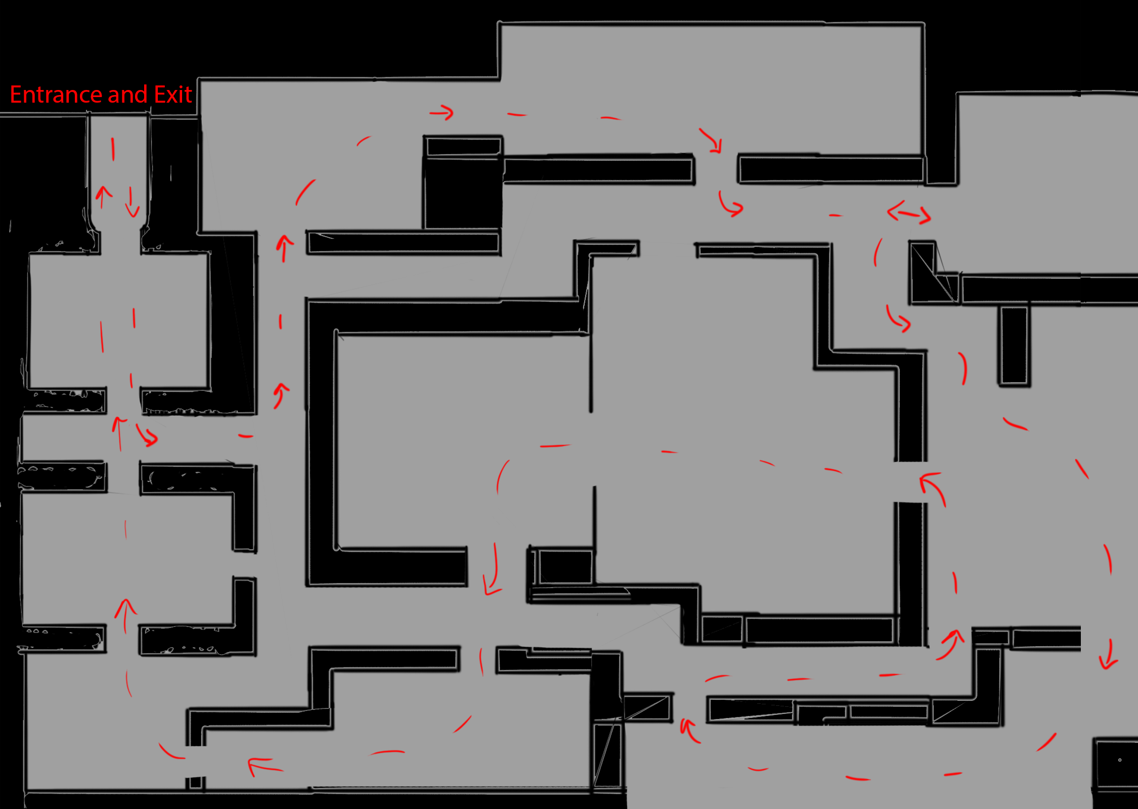
Tutorial Level
This picture above is the layout of our tutorial level, much shorter than all the other levels but by design. The goal of the tutorial level is to simply to acclimate the player to the style of turn-based combat that we are aiming for, otherwise it is throwing them into the deep end. We wanted to avoid hand holding the player too much throughout the tutorial as the gameplay mechanics are fairly simple in design and once understood, the game opens up and allows for the strategy and squad-based decisions to really show their full potential. The arrows shown on this diagram are the route that I would expect the player to take, as mentioned that in later diagrams this is much more complex but for the tutorial very simple and straightforward, focusing on teaching the player rather than showcasing the design of the level.

This picture above showcases the potential spawn areas of the enemies for the tutorial, with a random value attached to each area, adding up to the required amount that the player has to eliminate for completing the level objective. Allowing for variation although this level is the one that will mostly likely have more hardcoded values since it is the tutorial.
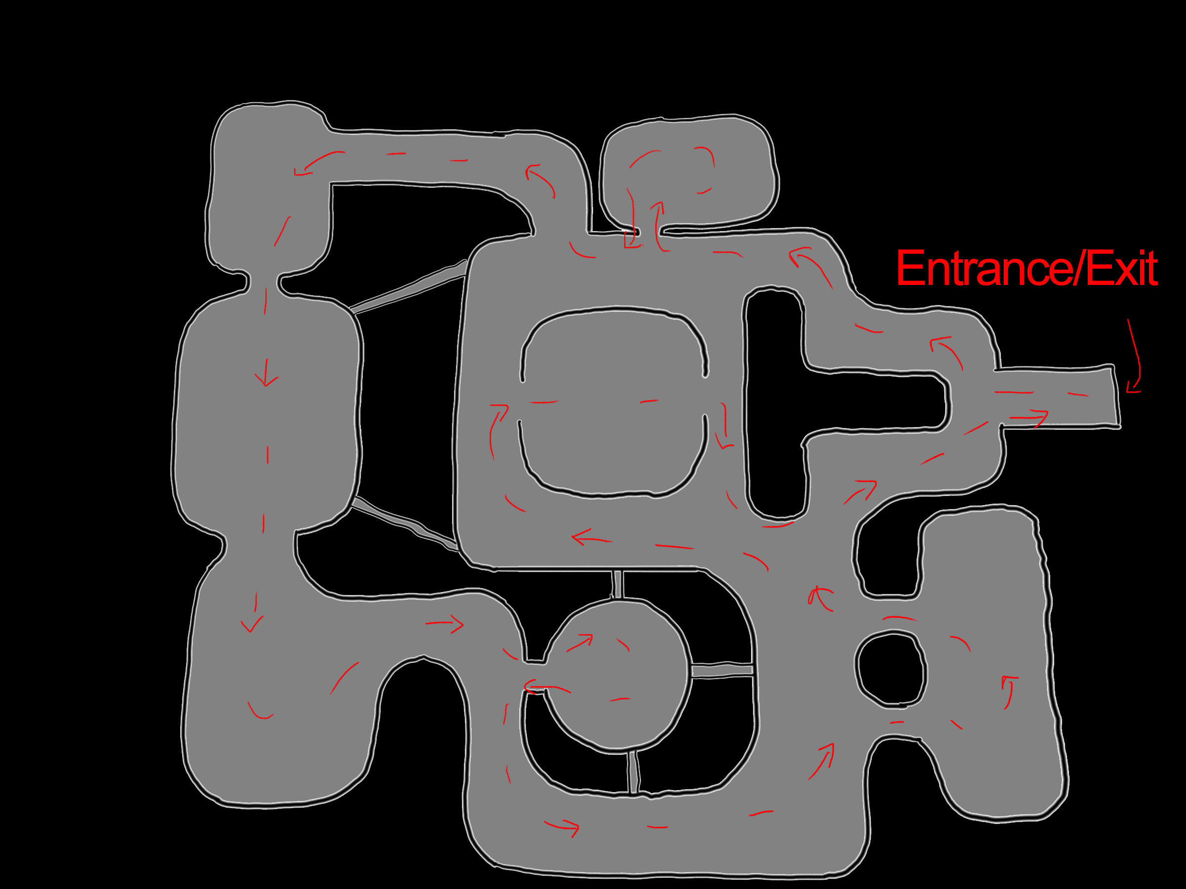
Level 1

These two pictures above showcase the second level layout, displaying the different paths that I would predict the player might take in order to traverse through the level. When making this level I was aiming for more of a spacestation feel to the design, that these areas all felt like they have been added to each other rather than being predesigned. Aiming for a more dynamic feel to the level while also mkaing sure that it evenly balanced on each side of the level so it does not matter which path you take but not too symmetrical.
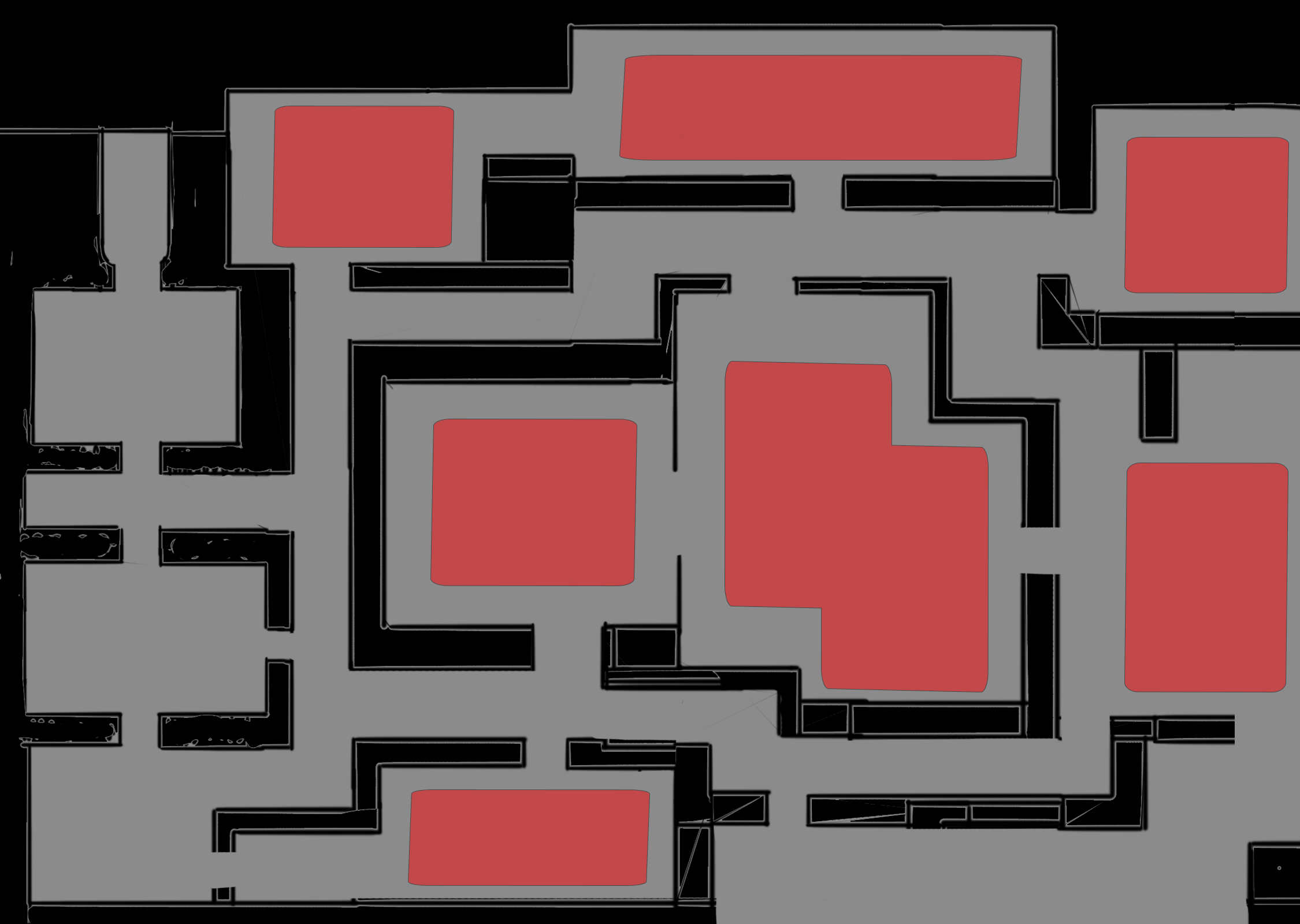
This is another example of potential spawn areas inside of the level, not every areas would be utilized each playthrough and sometimes all areas could have some enemies. These areas are ideally spread in a way that levels could be quick but ideally you would need to traverse around 75% of the level before you could leave and finish the objectives unless the player realizes they take too many casualities and decide the mission is not worth it.
Lastly, this is an example of part of the idea with areas being cutoff to add variation to different runs or to limit the length of levels to allow better times for the players in the presentation. Each different run would randomly turn on or off depends on the random variation you get going into.
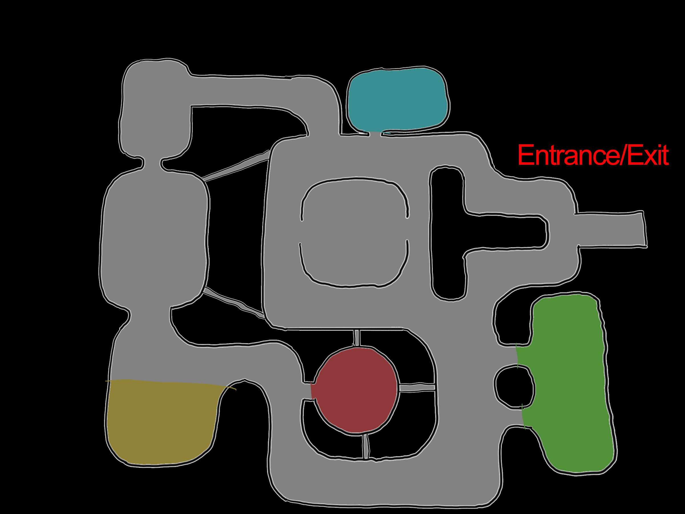
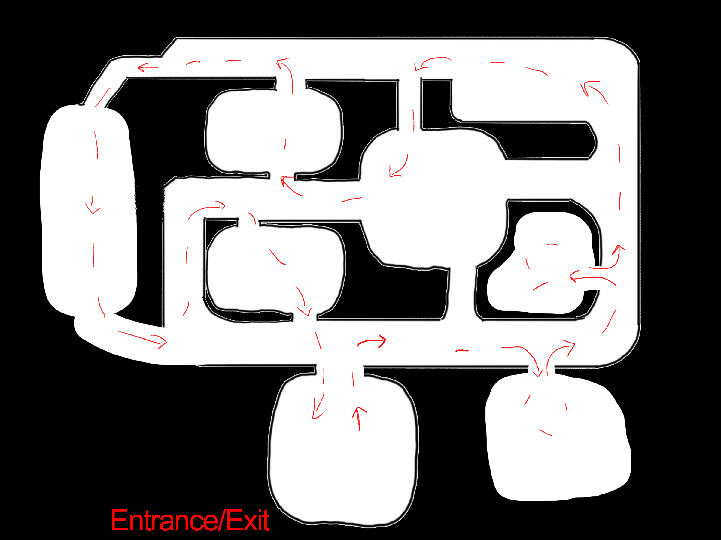
Level 2
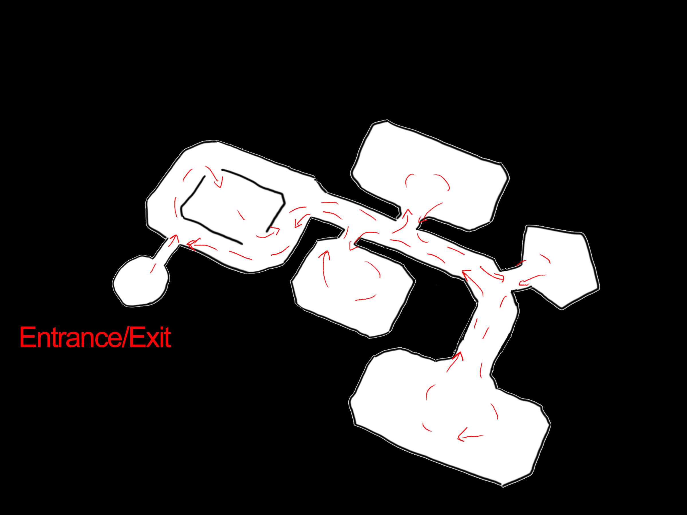
This is an example of the main two paths that I assume the player will attempt to traverse the level, trying to visit each room in a way that feels organic and efficient to minimize the amount of time spent wandering as they will see the level from top down just as we do here just in a smaller scale. Wanting to create a different feel than the previous levels, this one combines the ideas of the others and makes a more circular layout with lots of ajoining rooms and hallways to give the player the idea of more than there is, causing lots of decisions to be made for pathing.
This picture represents the potential enemy spawns for the areas inside of the second level trying to make sure that they feel realistic in locations but also adhereing to the best gameplay that I can offer the player inside the level. Balancing out the map in order to feel like it is not too heavy towards one side and reward or force the player to see at least 75% of the map again.
This is another example of rooms that could be closed off to vastly change the way the player would traverse the level but without causing too much issues in the flow of the level. Still giving the player as much agency as I can while also changing the gameplay loop slightly to change up their experience.
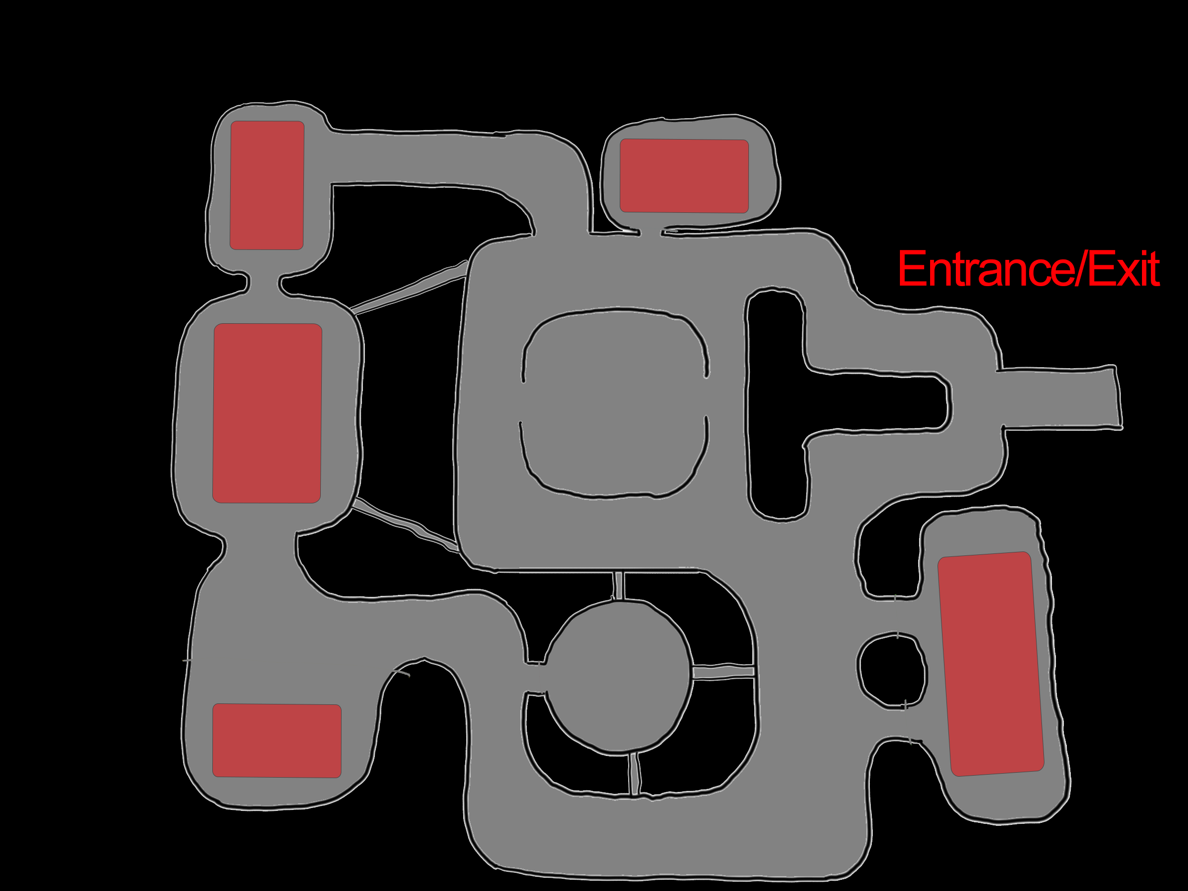
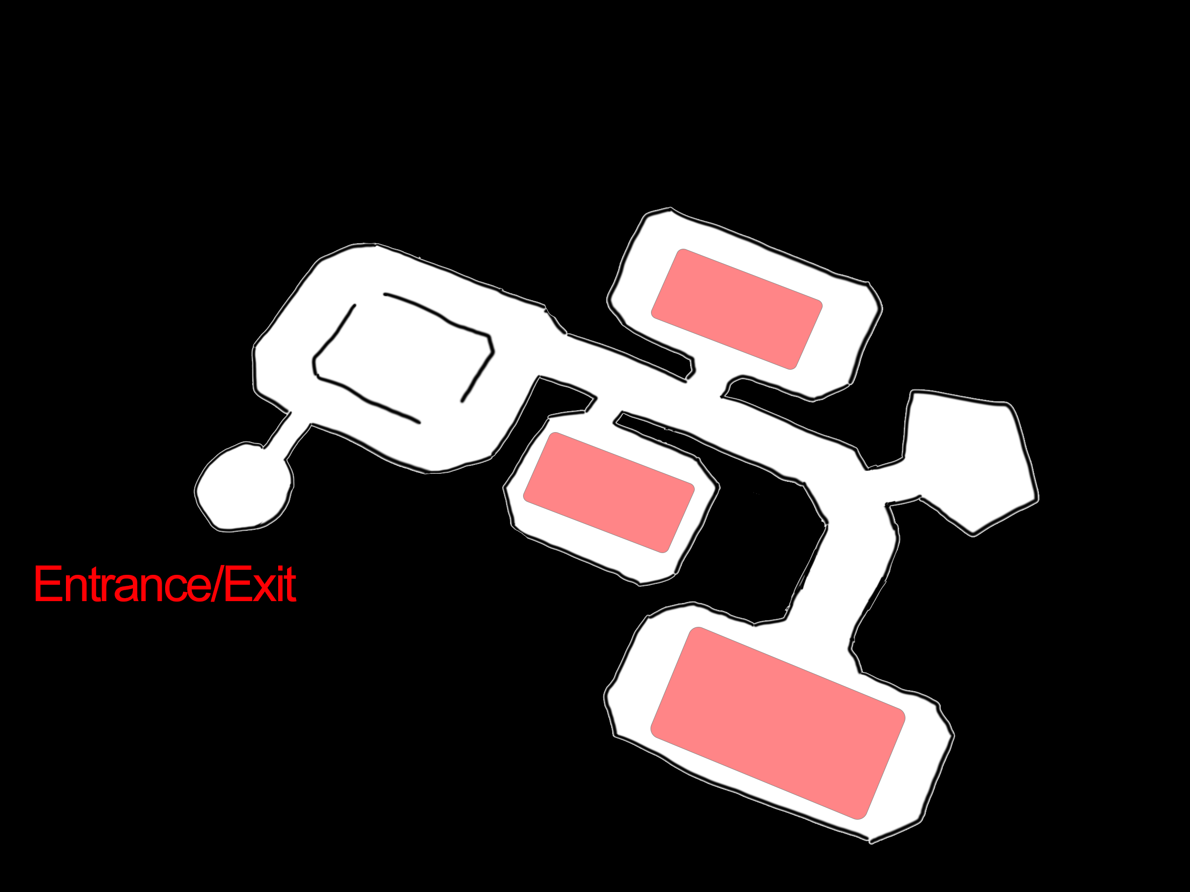
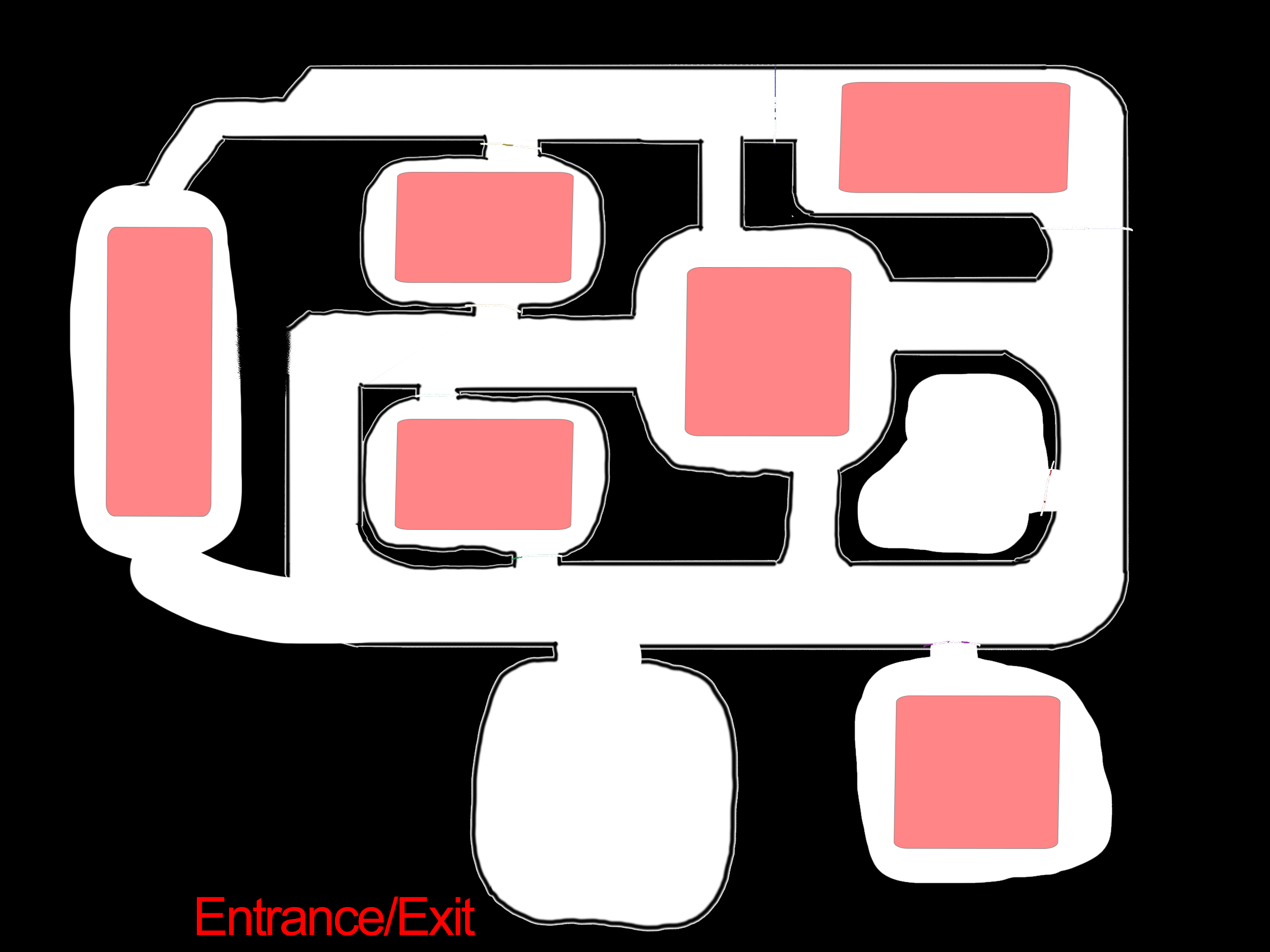
Level 3
This level would be the highest difficulty of the selected levels in the veritcal slice, being designed as if it was on a spaceship, everything is more cluttered and cohesive as if it was designed all together in the process.
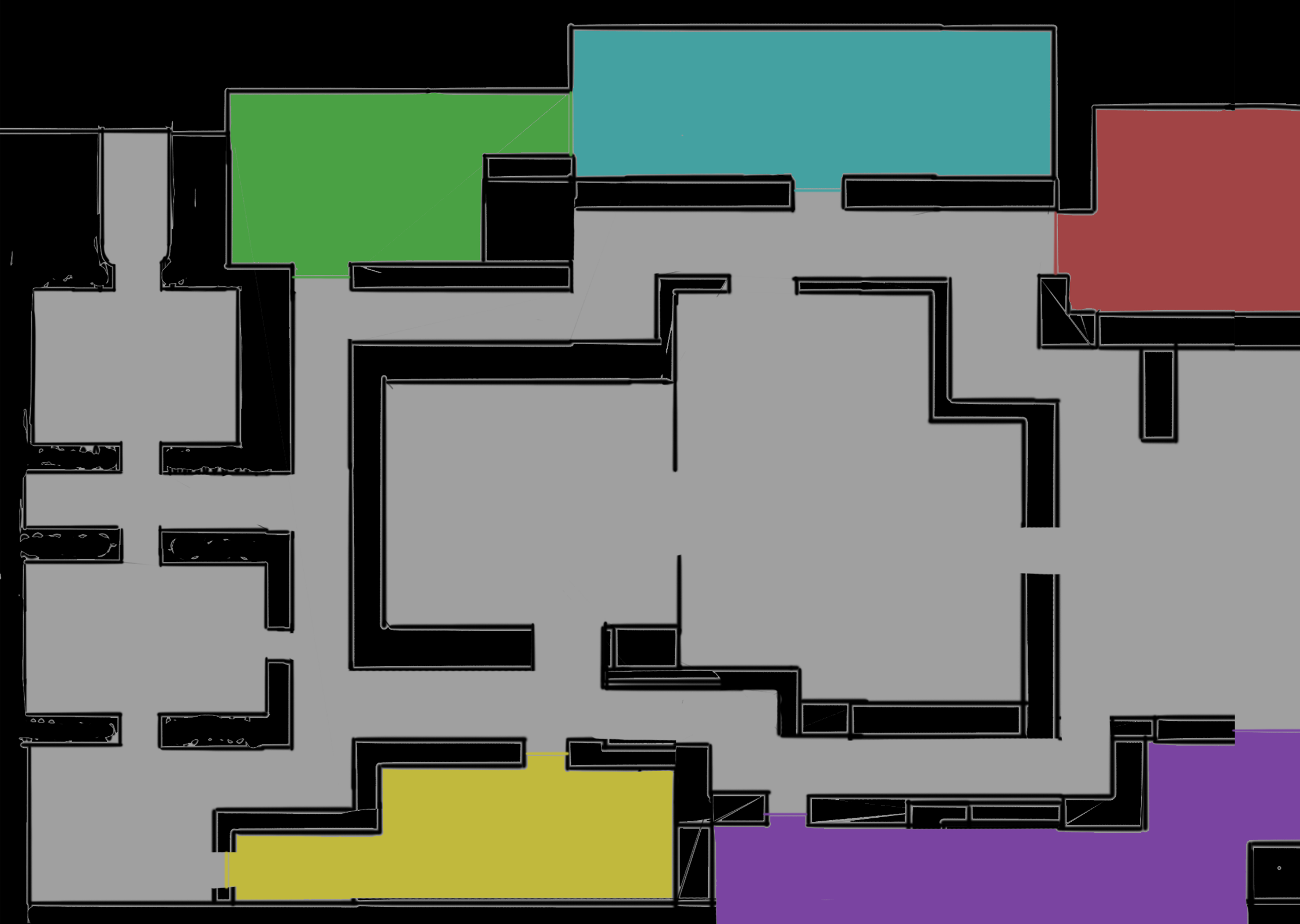
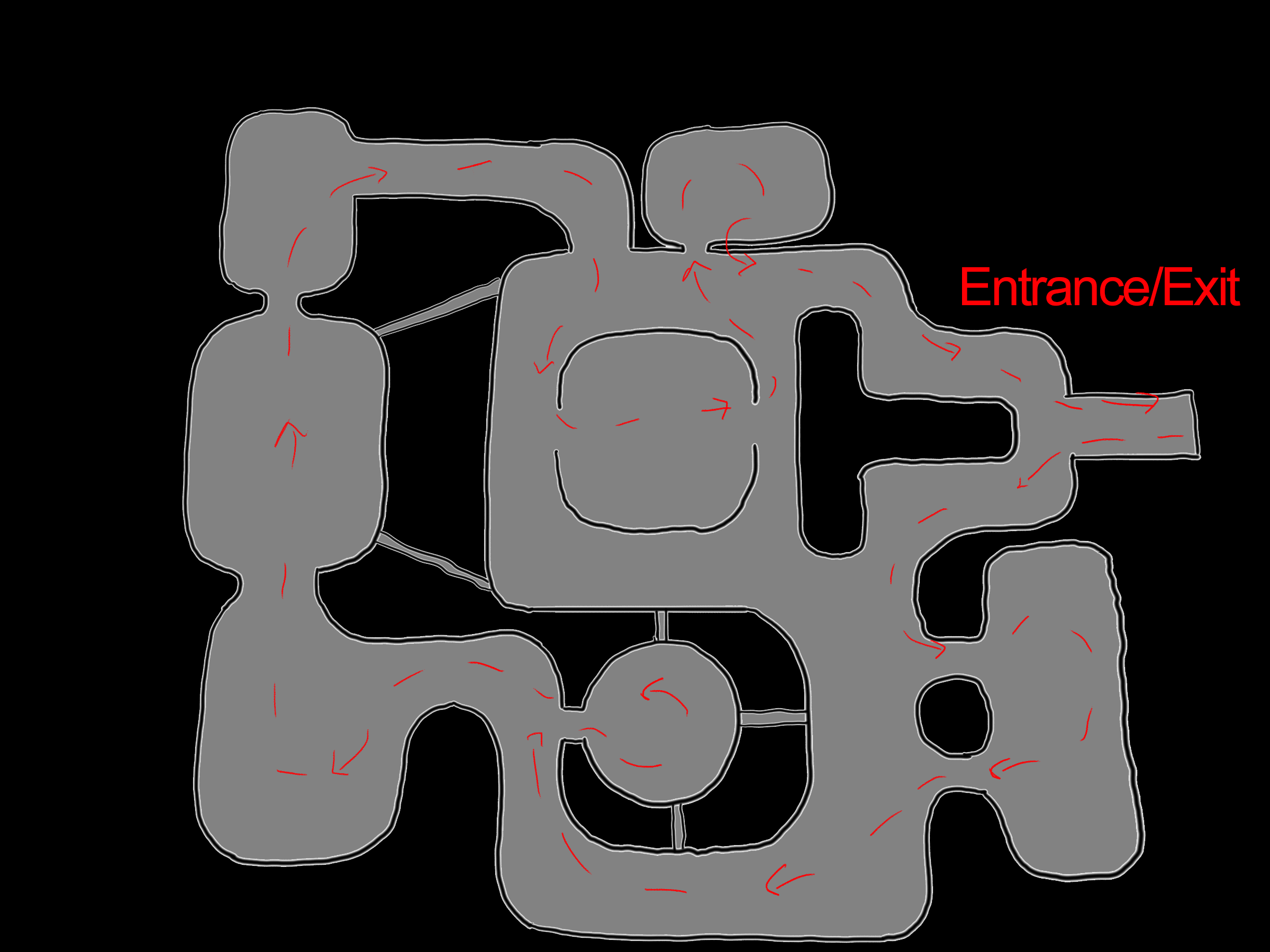
These once again represent the expected main paths that a player may take through the level for me to try and guide them to get the experience that I want them to have. Therefore allowing me to figure out how I should setup the level to ensure that they get what I want them to out of it. Combining the idea of hallways and lots of rooms connecting to one another to ensure a free flowing level layout.
These are the final examples of potential spawn areas for the enemies inside of the third level in Xenex. Trying to ensure that the combat areas are not too close to the entrance of the level and allowing the player to explore and decide how they will go through the level before they have to worry about combat.
Lastly, this is a picture once again representing the areas that have potential of being cut off or shut in order to make variation in the levels to give different experiences in multiple level runs. The rooms that would be cut off are designed in a way that it should not effect the feeling or flow through the level.
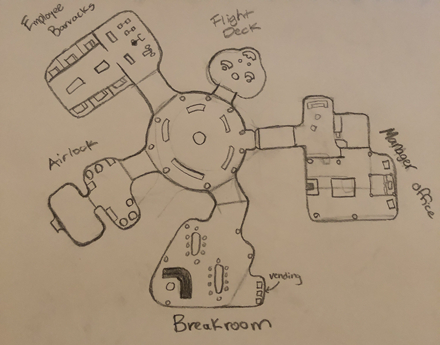
HQ Level
Lastly, here is the "home base" or HQ level which is where the player can manage their details around their squad, missions select, and their money for their company funds. A nice little area to showcase more of the humor side of things with less of the combat and stress of the gameplay loop.
Leave a comment
Log in with itch.io to leave a comment.